
![]()
![]()
![]()
![]()
![]()
![]()
Part Two
November 11: Emma survived the night. She still shakes, and has little energy. I hope she has seen the worst of it. I have set the task today to clean up, and to document more thoroughly everything I was working on in my irresponsible way. I mustn't forget the discovery that the soap changes some reds to blue--I am sure it must be the alkali, but more tests need to be made. I don't even know what reds they were. Every one needs testing, first with the soap, then when I find the one(s), with alkali to see if I am right. I felt as weary as Emma today, and a bit shaky myself, imagining myself somehow carelessly ingesting some of that wickedly poisonous rock. I doubt I will do anything with it, now, though it is a pity: it is the best yellow I have seen, by far. My luck, it will be a good pigment, too. I never thought this pastime would become a deadly game. Too tired. Must go to bed. Back to it tomorrow.
November 12: Emma still listless, but eating more, retching less. I found the plants that produced the red that turns blue. There are two of them. I tested both the soap and crude lye from ash, and both made the red turn blue. I added vinegar then, and they returned to red. This is very interesting, but I wonder how stable these colours will be. If nothing else, it gives me an indicator for acidity and alkalinity, though I am not sure what I would use that for. I soaked up the colours with small strips of linen to dry them out. I will add water to the cloth to retrieve the colour when I need it.
Just feeling spiteful, I guess, and it gave me the courage to try the jewellery. I broke up the sapphire, and pounded it and ground it up: it became white as ground glass! I stared out the window for some time after this, watching the ceaseless rains. I even tried grinding the broken goblet, and for a while it looked like it might be a good colour, but when I ground it fine, the colour disappeared. Maybe the only blue possible is this fickle red/blue stuff!
November 13: It occurs to me that I should record what I have done more thoroughly. I have decided to paint a sample of each colour alongside the notes about it. I will use the egg white as a medium: it seems sticky enough for mere pages, there should be no problem. I used a fair bit of water to break up the whites, but they were still very stringy. Finally, I used a fork to whip the whites. When they settled, there was a liquid on the bottom that was quite usable. I began to work through my notes, substance by substance, painting in the colours, using my eggwhite medium. The work went quickly, and the medium dried easily, but there were many examples to do. More than enough for one day.
November 14: It is my day off again. I need the rest. Tomorrow I will continue painting my colours in my book.
November 15: While I am not ready to grind rocks yet, I am curious about the red pebbles I found on the beach. I wore a cloth around my mouth in case it was poisonous, and I ground them. They became a deep, bright scarlet. I preserved the water-paste in a jar, and mixed a minutely small part of the colour in the eggwhite medium, and painted it into the sample book. What a vivid red! It makes all the other colours seem doubly dull by comparison. I am not even sure I can use this colour unless I get other, brighter colours.
November 17: Finally finished recording all the colours. I'm not sure what to do next. I am tempted to start another painting, but I think I should press on with my researches, and not let myself get behind. I have been thinking about my need for a white with more opacity. The whites from bone, chalk, eggshell and seashell are limited: they work well with the eggwhite medium, but in the wax, they go a pale, transparent brownish colour. What did Chris always rant and rave about? Lead white: how great it was, how creamy, how smooth, how crisp, how white! At the time, I just thought about how poisonous! After the bout Emma and I had with that vicious yellow (which I now call Poison Yellow), I am thinking lead is probably more easily handled than that! How would I get a lead white? If I got some lead, could I somehow get a white crust to grow on it, like on an old cheese? How would I do it? It would be a kind of white rust. Damp, and maybe acid.
I took a large clay pot and put cups and bowls in it part way up, then half-filled it with vinegar. I laid a piece of moss on top, and put some bits and pieces of lead on it, then nearly closed the lid. The stink was too bad for indoors, so I put it outside the hut, under the overhang of the roof. We'll see what happens.
November 30: The lead encrusted beautifully with a creamy white material that powders right off the metal. I gathered it carefully, out under the overhang of the house, which I think of as my "verandah," using a cloth tied over my mouth. I washed carefully after gathering the material, then removed my clothes inside, and changed. I set the clothes outside. I am determined to be careful with this Lead white. Its opacity is magnificent! It is well worth the care it requires. I wonder what other colours I can make. Why not try rust itself? I will scar some iron, and set it out in the wet. What other metals can I use? Why not copper? It may make a decent green. I put it in the same setup as I used to make the lead white. Seems likely to work. I wish I knew the colours of the patinas of other metals, but I cannot think. I am going to bed somewhat satisfied at my accomplishments, at least.
December 4: The copper yielded a brilliant green (Copper Green, of course). I gathered it with as much care as the lead, as I believe this green leads to some kind of fever. I am learning to regard my materials with great caution. Emma is fully recovered now, but I am not sure either of us have completely gotten over that scare.
December 5: My rest day come round again. I am beginning to feel grateful for the rhythm of working and resting. It has been all work for far, far too long now. Even my colours can use a break. I think I have gone as far as I can for now with the metal encrustations, but I will keep other metals in mind for experimentation. Tomorrow, I will start seriously on grinding the coloured stones. After that, I will start treating things with different materials, like acid or heat, to see what happens. I plan to relax, sit by the fire, and visit with Emma all day. And eat, of course. Of course.
December 6: I spent a great deal of time crushing up the blue stone and the green stone I found in proximity to each other. I tried grinding the blue stone first, and it gave a beautiful, rich, deep underwater blue...and then it all went gray when I ground it finer. I was frustrated and angry at first, then thought about it. Maybe there is an optimum particle size, and if I don't get finer than that, I can get away with it. I tried again, and stopped just as the blue began to pale. I'll need to get used to this, so I can anticipate the right moment to stop. I tried the particles with the eggwhite mixture on the back of one of the maps, and it was beautiful. Somewhat gritty to paint with, but I can live with that. I painted a good sample in my log. The green went exactly the same. They are brother and sister, these two, I am sure of it. So, two good colours so far.
Next, I tried the liver-coloured pebbles from the beach. They were a strange material: less like rock, and more like a kind of earth or clay, though not at all flexible like clay. The grinding only broke up the lumps, and enabled me to make a paste with water. This material is almost pure pigment. I tried one of the lighter-coloured ones, and it made a brilliant scarlet that was enough to take my breath away. I have decided to call this colour Pebble Scarlet. How I have missed such vivid tones! With this colour, I will need all my colours brighter. I can use my new Stone Blue and Stone Green, but there is no good yellow but the treacherous one. I may need to use it, albeit with great care. The reddish encrustation near the yellow makes another, yellower red, but I will avoid it unless I need it, because I fear the yellow and red are also brother and sister of a more sinister kind.
There is still no deep, cool red, nor any light, bright blue. I am trying not to be impatient. This has been a great victory, but these few brilliant shades make all my colours seem dull and valueless. It would be like hanging a painting of a Great Master on the wall near some of my own: my pictures would almost cringe, and the whole room would appear shabby and shameful. These beautiful colours put everything else I have done to shame in the same way.
December 7: Had no particular luck with any other rocks today. In boredom, thinking about the Stone blue and Stone green, I thought to give the blue goblets another try. I dug out the pieces from the other broken glass in the trunk, and ground the pieces not too fine. There was a point at which I achieved a very clear, strong sky blue. I will call this colour Glass Blue.
December 8: I checked my log today, and found many of my earliest colours, the plant materials, are fading badly. Even away from the light, many have gone pale brown or gray. This never occurred to me, that I might achieve something, only to have it slip away. I look back on my easy optimism with irony. Still, I have achieved much. I must allow whatever will happen to happen. There are still many things left to try.
Notes on the Materials in this Island Journal:
The materials on the island are all actual, historical materials that can be found and processed in the same way today. The major problem in searching for colours is how few substances actually yield any colouring material of any permanence. Plant materials generally yield impermanent stains or half-permanent dyes, not pigments, as needed for painting. Rocks are generally useless--even gemstones have too little colouring material to be anything but white when ground. Clays are good, but yield very dull, gray colours. Mineral compounds, either found naturally on solid rock, or loose (as the red "pebbles" on the shore), or manufactured, like the metal encrustations created with acid fumes, are somewhat more promising. The worst problem is when one really brilliant colour is achieved: this creates pressure for a much brighter palette. Most of the materials used in this story have been replaced by manufactured colours, both of mineral and artificial origin, such as the anilines, coal-tar derivatives, and other synthetic organic pigments.
The following notes come from a number of sources. Details of historical nomenclature are normally from Harley; French and German names of pigments from Wehlte. Safety notes are from Michael McCann's "Artist Beware" (Watson Guptill, 1979). Direct quotes are noted. These are the materials, in the order of their discovery in the story:
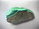
The marbled deep green is Malachite, and the smoother, bluer green is Chrysocolla
Malachite, CuCO3-Cu(OH)2 was called "green bice" in 17th century England, though sometimes that term referred to a mixed colour. Also called Mountain Green and Azure green. It was eventually replaced, during the 19th century, by more brilliant manufactured greens. Also called "Bremen green."
Chrysocolla, CuSiO3-nH2O, has not been found in any analysis of artists' pigments, but this colour was used in water media, and tests have been made mainly on easel paintings. The documentary sources referring to "ceder green" are most likely Chrysocolla, from the Greek for "gold glue," because this material was used in ancient times as an adhesive for gold. Harley thinks "ceder" is a corruption of "solder." There is some confusion between Chrysocolla and Malachite, as they had similar properties, and were likely to be refined and used in the same way. Chrysocolla fell out of favour in the 17th century, because it became more difficult to obtain, and various manufactured copper pigments became more readily available.
Malachite (and probably Chrysocolla) is slightly toxic by the skin, moderately toxic by inhalation and ingestion. It may cause irritation of the skin, eyes, nose, throat, stomach and intestines, and vomiting. Chronic exposure may cause anemia.
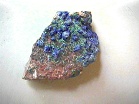
Azurite, with some accompanying Malachite
Azurite, 2CuCO3-Cu(OH)2, a naturally-occurring basic copper carbonate, often found with Malachite. Also called "lapis Armenius" and "blue bice," but many blue names for various materials have been confused with each other at different times. It ceased to be used in the 19th century, with the influx of the manufactured copper blues.
Azurite has much the same toxicity as Malachite.
In French, bleu Paul Véronèse, cendre, in German, Azurit, Bergblau.
Immovable Green Rock: this is not a pigment, but an outcropping of jade (nephrite), too tough to even attempt to use.
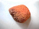
Pebble Red: this material was once known as "cinnabar," or naturally-occurring vermilion, a natural mercuric sulphide (HgS). Historically, vermillion caused as much consternation as it does here on the island, as it showed up the other colours as being dull and inadequate, and led to the pressure for a much brighter palette. Also called "synoper" or "sinopia."
Vermilion is moderately toxic by skin contact, and highly toxic by inhalation and ingestion, causing mercury poisoning, which can cause severe damage to the nervous system and kidneys.
"Light" and "deep" refer to the bright red varieties and those with a yellow tinge. In French, vermillion clair and foncé, in German, Zinnober hell and dunkel.
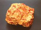
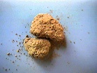
Orpiment (with veins of Realgar)
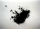
Orpiment is no longer available as a pigment, except in certain controlled circumstances, for the use of conservators. It is moderately toxic by skin contact, and highly toxic by inhalation and ingestion. It is a known human carcinogen. McCann says, "Inhalation can cause respiratory irritation and skin and lung cancer. Inhalation or ingestion may cause digestive disturbances, liver damage, peripheral nervous system damage, and kidney and blood damage. Acute ingestion may be fatal." Emma is a lucky little bird, indeed, to have survived her ordeal!
In French, this pigment is jaune d'arsenic, in German, Auripigment, Rauschrot.
Poison Yellow's Red Cousin: this material, called "Realgar," or sometimes, "Orange Orpiment," is also an arsenic compound, as poisonous as Orpiment (As2S2). It was used widely in antiquity up until the Renaissance. Wehlte says, "Vitruvius and Pliny the Elder mention two kinds of realgar, a yellow variety and a red variety. Raehlmann found both on Pompeian walls.... Raehlman also reports his identification of the pigment partly mixed with lapis lazuli to make green, in several paintings of the Bellini school, as well as in the work of Perugino and Dürer."
In French, it is known as Réalgar, in German, Realgar, Rauschrot.
Lamp Black: a very straightforward colour with a name still used today, lamp black is relatively clean soot, or carbon. Soot, along with charcoal (and ochre), is one of the oldest pigments known. Lamp black may have some residual fat, but not as much as bistre (called "Firepit brown" by the castaway).
Carbon is moderately toxic by skin contact and inhalation; by ingestion, its toxicity is negligible. Carbon has been known as a human carcinogen for over 200 years, from its effects on chimneysweeps, though it is still not widely protected against in the workplace, even now. People changing toner cartridges in laser printers, or worse, pouring dry toner into photocopiers, should take care not to breathe the dust, and to wash their hands afterwards, though the instructions say nothing of any hazard. Painters should also be careful when grinding this pigment, though a dust mask and washing afterwards should alleviate the risk.
Also known as vegetable black, gas black, and carbon black (in French, noir de bougie, in German, Lampenschwarz).
Firepit Brown: this colour, normally called "bistre," a tarry brown soot obtained from wood (often beech), is less pure than lamp black, having more partly-burnt fatty material. It was mainly used in watercolour or ink. Sepia supplanted bistre in the 19th century, and the original pigment is no longer available, though modern compounds are sometimes called by this name. Original bistre would have similar toxicity to lampblack, although some research into the burnt fats from barbecuing indicates carcinogenic substances are produced in charred fats, so bistre may be slightly more dangerous than clean soot.
Bone White: (Ca3(PO4)2), is a material gritty to paint with, and has little covering power, though it was adequate in water-based media. A related colour used by the castaway is Shell White, (CaCO3), made of ground up eggshell or seashell. The main advantage in these whites lies in their neutrality, which was more important earlier than it is today. More about this in the next installment of the story.
Bone black: this colour also still bears the same name: it is still mainly carbon, but with a slightly different physical structure (C, Ca3(PO4)2). It is not so fine and light as Lamp Black, so mixes better with other colours without flocculating (separating out). It is, by and large, a better, deeper black than lamp black, though less suitable for broad washes. Also formerly made of ivory, then called Ivory Black.
Chalk: the significance and usefulness of this material has not yet been discovered by our castaway. More about this next time.
Red saps: these two materials feature later.
Tree Boles: these materials are waiting for their potential to be unlocked for our castaway.
Berry Green: this material is made from buckthorn berries, a variety of Rhamnus. As our castaway found, this colour contains its own gum-like water-medium, so needs no addition. It is ready to paint with as is. This colour is normally known as Sap Green, but as it was often stored in bladders, it is also referred to as bladder green, or in French, vert de vessie.
Three-Seed Red: this colour is distinguished by two things: the three-fold seed arrangement, and the fact that it is a red that turns blue in contact with alkali (in the story, lye soap). This colour, first noted between the twelfth and fourteenth centuries, is made from the seeds of the Crozophora tinctoria, and is referred to in medieval texts as "turnsole" when blue, and "folium" when red. The blue was more used than the red, as there were so few blues available. Medieval manufacture involved squeezing the juice out of the seed capsules and soaking it up with cloth ("clothlets"). For red, this was all that was done. For violet, the cloths would first be soaked in lime water (alkali lime, not the fruit); for a deep blue, these lime-treated cloths full of seed-juice would be exposed to ammonia fumes to make the material more alkaline. The blue had a tendency to revert to violet, but this was also a colour much sought-after in the middle ages, so this was not considered a fault. Turnsole introduced the practice of using "clothlets," which enabled manuscript painters to make use of many beautiful colours used in dyeing cloth.
Lichen Red: this is a colour more used in the past for dyeing than for painting. It is extracted from lichens of the Roccella group, often referred to as "Orchil." While this lichen did grow in Wales and England, it was not plentiful, and in the 18th century, large quantitites of this "orchella weed" were imported into Britain from the Canary Islands. Like Turnsole and Litmus, this is also an "indicator dye," turning red in acid and blue in alkali.
Root Brown: the potential of this material has not yet even begun to be realized at this point in the story. This is much as it was historically; later, this difficult material would became the ideal and measure of what a pigment should be.
Deep Yellow Earth: This is probably a yellow iron oxide, such as Fe2O3-H2O or Fe2O3. These colours can range from yellow through red and into a true brown. Natural ochres are mined in specific places, and, as each has its own colour and look, they tend to be named for their place of origin.
Transparent Yellow Earth: this would be a yellow iron oxide, as above, but one exhibiting a high degree of transparency, caused by a high content of colloidal silica. Transparent yellow ochre was found near Sienna, Italy, so was called Terra di Siena, or just Sienna. This pigment has been known since early antiquity, and may even have been used in early cave paintings.
In French, terre de Sienne, in German, Terra di Siena, Sienaerde.
Red Earth: an iron oxide of similar composition to the yellow ochres, red ochres are also named after their place of origin, such as Pozzuoli red, or Indian red, or Venetian red. Called sinopis or sinopia by the ancients.
Violet Earth: Generally known as caput mortuum, or "death's head," this very dull violet is a useful mixing colour, though the name refers usually to the manufactured pigment, a by-product of the manufacture of fuming sulphuric acid. Similar compounds occur naturally, and these are iron oxide clays.
Olive Earth: This is known in modern parlance as "raw umber," and is related to the ochres, but with a high proportion of manganese dioxide, giving the dark brown appearance. Umbers are hydrated ferric oxides with hydrated manganese oxides and aluminum silicate, in no definate formula. Umber is assumed to have been used in early cave painting, but this has not been verified by testing. It is mentioned as early as the 11th century, but the shade was often mixed from ocher, black, and sienna. This is preferable to using umber in oils, which requires so much oil that it darkens noticeably over only a few years. This darkening, and the tendency of manganese to form soaps with oil, make it less than desirable as a pigment, though the colour is usually quite useful for mixing. A perfectly serviceable pigment in pastel and water media.
Not significantly toxic by skin contact, the manganese in umber is highly toxic by ingestion and inhalation, and poisoning "causes a serious nervous system disease resembling Parkinson's disease. Early symptoms include apathy, loss of appetite, weakness, spasms, headaches, and irritability." (Artist Beware, Michael McCann, Watson-Guptill, 1979).
Also called Cappagh brown, and in French, terre d'ombre nat., in German, Umbra natur.
Brown Earth: This is possibly a brown ochre, similar to yellow ochre, but darker, usually caused by manganese oxides. When the manganese content becomes predominant, umbers (such as the "olive earth" above) result.
Earth Black: This may be a natural black slate (Aluminum silicate with up to 30% carbon), called Mineral black, black chalk, Biddeford black, or Davy's Gray (in German, Schieferschwarz). This material is often blue-gray, but some deposits are almost black.
Another possibility is that the castaway found a deposit of Manganese Black (MnO2), a heavy mineral black that is useful in techniques where the efflorescence of materials such Bone Black are problematical, though it tends to settle out in water-based techniques. In this case, toxicity should be similar to other Manganese colours, like Olive Earth (raw umber). Manganese black has the highest tinting strength of all black pigments.
Note on Simultaneous Contrast: Although people have a desire for bright colours, they are not necessary for painting. The illusion of full colour can be created with as few colours as yellow and red earth, black and white. Earth yellow, which is really a yellow-brown, can seem a surprisingly bright yellow next to other earth colours. Reddish-brown earth can seem quite red, and a gray mixture can, when juxtaposed with a warm colour, appear blue. A serviceable green can similarly be made with yellow earth and black. The tendency for juxtaposed colours to bring out the opposite, or complementary colour in each other, creating the illusion of more vivid colour contrast, is called simultaneous contrast.
A wider variety of seeming colour is achievable using painting techniques of the Masters, such as glazing with warm colours and scumbling with cool colours (glazing being the application of transparent colour, scumbling the application of semi-opaque colour). An amazing amount of variation in colour and effect can be achieved with only black, white, and a warm colour, usually a brown. Scumbling white over black can give a violet appearance, over brown, a pinkish or greenish appearance; many warm and golden hues can be simulated with a warm brown glaze (see Sir Charles Locke Eastlake's Methods & Materials of the Great Schools & Masters for more detail on these techniques). The nature of colour perception is such that an unexpectedly large number of optical effects are possible with extremely limited means.
In the Middle Ages, the art emphasized the beauty and jewel-like quality of fine, bright pigments. These colours were often used unmixed, especially in manuscript painting. Many of the brightest colours were quite costly, and had to be used sparingly.
Ironically, today pure bright colours are so common and cheap that every painter has them, and thinks nothing of mixing brown, black, or gray or a bit of the complementary (opposite) colour to "break" them, and mute the colour -- a practice that would have sent the medieval painters into a dead faint. Much abstract art would make little sense without a wide and varied palette, and of course, Colour Field Painting would not have existed at all.
Ground Sapphire: Of course, our castaway discovers that, however beautiful, gemstones have little colouring material, and when ground, lose their colour and become white as ground glass. It takes very little material to colour a gemstone, a glass, or a glaze, compared to making a pigment.
Eggwhite medium: this material was well-known and used in the Middle Ages. It was called "glair," and was prepared in different ways. As eggwhite in its natural state is like a liquid plastic, it needs its structure broken in some way in order to be used for painting. Whipping the eggwhite and allowing it to stand converts it to a usable liquid; other painters would strain it through a sponge or cloth, which tended to contaminate it with dirt and grease. The preferred method was whipping the eggwhite using immaculate implements free of all trace of grease. Glair was used most often for manuscript illumination, being very crisp and clean to work with. It is a delicate binder, though, and does not affect the colours it is used with as much as gum arabic (the basis of watercolours). Gum began to displace glair after the 14th century, particularly to bring out the depth of colour in blues.
Glair was not always used alone: sometimes glair and gum were mixed; sometimes glair was mixed with eggyolk, especially when used with reds, though yolk alone was too soft to withstand the friction of one book page against another. Glair was often mixed with ear wax, which is a natural surfactant, preventing the glair from frothing up when mixed vigorously. Sugar and honey were also used as humectants, to avoid brittleness.
Glass Blue: this is a coarsely-ground cobalt glass (K, Co(Al), silicate), which was known as "smalt." This was the only cobalt-bearing blue available before the element was isolated in the 18th century. Harley says that cobalt is named for the goblins that hindered miners' work, since the cobalt arsenide found in mines would eat away the flesh of anyone in proximity to it. Leather masks and protective gloves were necessary for miners in these areas.
Cobalt glass may have been manufactured as early as the 14th century, possibly an Italian invention, so was the most readily-available source for our castaway. Refined cobalt, or "saffer, " was known in Europe in the 16th century: its composition is debatable, but it appears to have been refined to remove the naturally-occurring arsenic. Smalt was made by mixing equal parts of saffer, silica and potash, and placing it in a furnace. The glass was then plunged into water, then ground, sieved and washed.
High grade smalt was deep purplish blue, useful for mixing purples, and was sometimes seen as a substitute for Ultramarine. It becomes much paler if ground too fine, a problem our castaway soon found. Smalt survived into the nineteenth century, but was replaced, in painting, with the cobalt blue we know today. Smalt is used in modern times only as a ceramic frit, or glaze. Because the cobalt is fused in glass, it is not poisonous, unlike other cobalt blues.
Also known as Saxon blue; in French, bleu d'émail, in German, Smalte.
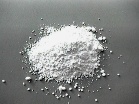
Lead White: Lead white, a basic lead carbonate (2PbCO3-Pb(OH)2), was one of the earliest manufactured pigments, made since the time of the ancient Egyptians and Greeks. For painting, lead white is useful for its handling properties, particularly, in oil paints, and the lead also acts as a drier in oil.
The method the castaway uses to manufacture this pigment is very similar to the way it was manufactured in the eighth century, though the pots should have been embedded in fermenting tan bark or dung to facilitate the change of the lead acetate to lead hydroxide and lead carbonate. This stack process, and the later Dutch stack process of the 17th century, are now replaced by more economical processes, though these are not an improvement on the older methods, from the artist's point of view. Cheaper commercial grades often contain too much lead acetate to be suitable for an artist's pigment, as the acetate is associated with undesirable yellowing. The best artist's grade of lead white is called Cremnitz White.
Historically, lead white was used as a cosmetic, generally as a base for facial foundation, or sometimes unmixed, for its whiteness, causing massive skin pocking and lead poisoning in many women. The dangers of lead have long been known: medieval writers warn against the "apoplexy, epilepsy, and paralysis" which can follow exposure to lead. Acute (short-term) lead poisoning causes the well-known "painter's colic"; chronic (long-term) poisoning is more serious, and can be fatal. It is slightly toxic through the skin, highly toxic by inhalation and ingestion, is a teratogen and suspected mutagen (causes mutations, therefore birth defects and possibly cancer).
The major danger to artists is by inhalation while grinding the pigment, or using it in materials like pastels and watercolours. Lead white is no longer used in these commercial products for this reason. Lead is best used in oil paints, and the dust avoided at all costs. These days, lead white is seldom sold as a pigment, so this problem occurs more for potters than painters, though very old painted cribs, wallpapers and house paints may contain lead white (some very old papers even contain arsenic green).
Lead poisoning affects the stomach and intestines (colic), can cause anemia, and lead to a weakening of wrists, fingers, ankles, and toes, and pain in joints and muscles. Lead poisoning can also cause liver and kidney damage. European doctors often treat chronic lead poisoning with a diet of citrus juices, as the citric acid leaches the lead out of the system, and passes it out of the body. In many European cities with lead water pipes, chronic lead poisoning was a common complaint, so doctors became accustomed to treating it.
This citrus-juice treatment is pooh-poohed by North American doctors, but I knew a woman who was a hobby potter for many years, foolishly firing her unvented kiln in her basement, often using lead glazes. She said that after every firing, her windows were covered with a murky film. Not surprisingly, after years of this, she developed lead poisoning: she could no longer move or walk, her wrists and ankles were so weak. It was all she could do to persuade her doctor to even test for lead, which he was not inclined to believe was the problem; when he saw her blood levels were as high as they were, he said there was nothing could be done. She heard about the citrus juice treatment, and within a month, she was walking again. Her recovery appears not to have changed her doctor's opinion. Lead poisoning is best avoided, but it is not untreatable. Ironically, the North American medical establishment is aware of the affinity citrus has for lead when it recommends citrus juices not be drunk out of lead-glazed ceramic ware.
White lead has been known by many names: Ceruse, flake white, snowflake white, Cremnitz white, Nottingham white (in French, blanc de plomb, blanc d'argent, in German, Bleiweiss, Kremserweiss.
Copper Green: also known as Verdigris (a corruption of the French vert-de-gris, or Greek Green), a basic acetate of copper (Cu(CH3-COO)2-2Cu(OH)2). It is a brilliant, attractive bluish green colour.
The method of manufacture is similar to the one used by the castaway, and similar to the way lead white is made. Verdigris was traditionally made with wine vinegar fumes in proximity with copper plates, generally in earthenware pots. Variations in verdigris can be explained by the use of brass or bronze instead of copper, and the nature of the vinegar, whether wine or apple. Unlike lead white, no fermenting tan or manure was needed in this process. Verdigris is more stable if it is dissolved in distilled vinegar, filtered, then recrystallized by evaporation, which neutralizes it, and makes it less prone to change from blue-green to green. Crude verdigris has been made in large commercial quantities for use in decorating and dyeing throughout the 17th and 18th centuries, and its ready availability made it attractive to artists, despite the fact its use was not recommended professional practice.
Verdigris is affected by moisture, blackened by alkalis, reacts badly with some other pigments, and may be darkened by gases in the atmosphere. Most verdigris used in Medieval times has now gone a dull brown, distorting our perception of the artists' original intentions. Verdigris is as poisonous as Malachite. Historically, these were the only dark greens available; when the more stable and non-toxic viridian (hydrated chromium oxide) was invented, verdigris was no longer needed.
In French, it is vert-de-gris, in German, Grünspan.
For further readings on colour theory, see the author's web page, Colour Theory.
© 1997, Carin Perron
About the author
A former art teacher, Carin has always been deeply interested in the minutiae of colour theory. In this article, she is finally able to synthesize various miscellaneous details from the history of art materials into a concrete form. For more information, see her web page, Index of Colour Topics.